Design theory explains the foundations and principles that govern the art of visual communication, studying how we see and perceive information, and how style, taste and trend are connected to the universal principles of aesthetics, common to all people. The representation of ideas has been a constant desire in our nature, with the first examples found in cave paintings that date back to approximately 40,000 years ago.
The concepts of Greek aesthetics, sensation and beauty of the Latin bonus (good, nice) are nothing more than a consensus on the subjectivity of a perception. The curious thing about art is that if there is a consensus there will be a basis we can study from. We anticipate that what underlies aesthetics is nothing more than harmony, stemming from the Greek word armós (adjustment), placing things next to each other in a way that is pleasant. In this process, geometry and proportions, as in other branches of artistic expression such as music, take a greater role.
In today's article we will present some of the basis applied to graphic design, reviewing three recurring themes that our graphic design team usually deals with along with our clients: Shape and Composition, Typography and Color Theory; the order of presentation of these three elements is intentional because it follows the logical flow of development.I
Due to the length of the article, we have divided it into three installments:
Form and Composition
Typography (Available on September 25)
Color Theory (Available on October 7)
FORM AND COMPOSITION
The Golden Ratio
As for the geometric composition, there is a proportion present in nature known as the golden ratio, which recurrently manifests itself in many of its elements.
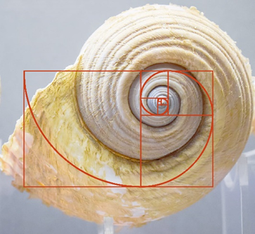
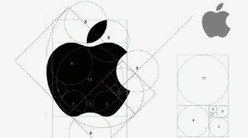
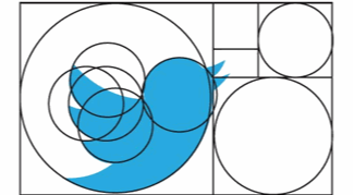
In addition, it may be familiar to you because we have emulated this geometry in other elements created by man such as art, architecture and even everyday elements such as credit cards or many of the logos you know such as Apple and Twitter, among others.
Its mathematical expression comes from the division in two of a segment, keeping the following proportions:
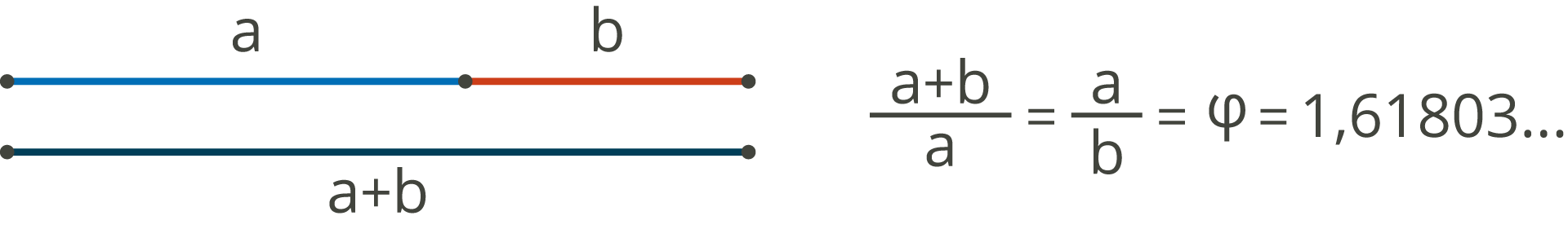
The total length a + b is to the longest segment a, as a is to the shortest segment b; Being the value of this ratio 1.6.
We also find it present as the limit of the Fibonacci series 0,1,1,2,3,5,8,13 where each number is constructed as the sum of the previous two and its limit is asymptotically due to excess and default to itself. If we make the ratio between two elements of the series, as we progress through it, the number converges more to the golden number 5/3 = 1.66; 13/8 = 1.62.
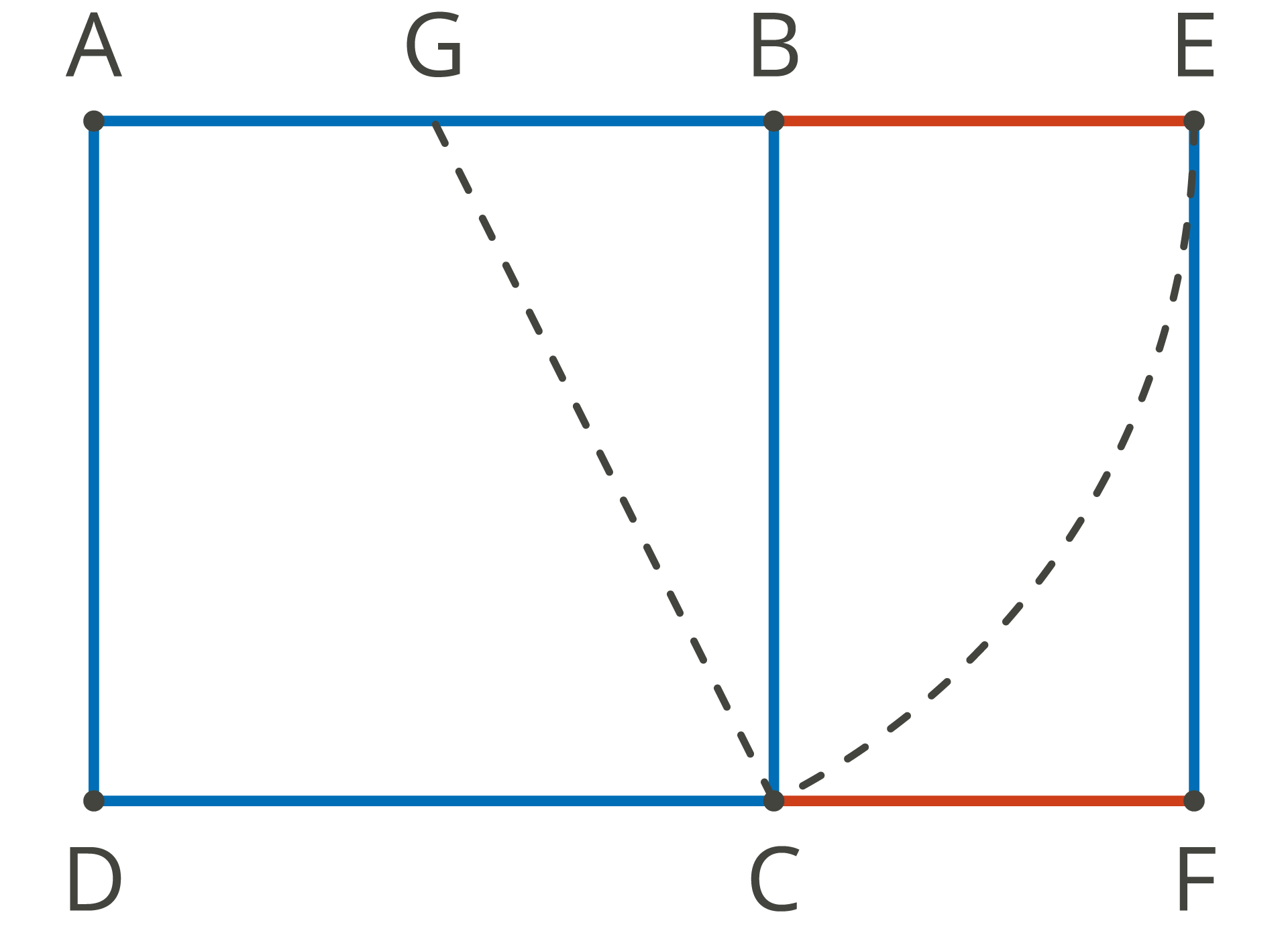
We can also build the relationship by means of what is known as the Golden Rectangle of Euclid, by drawing an arc from the perpendicular bisector (G) of one of the sides with radius one of the opposite vertices (GC) and extending the segment to the extension of segment AB to construct AC.
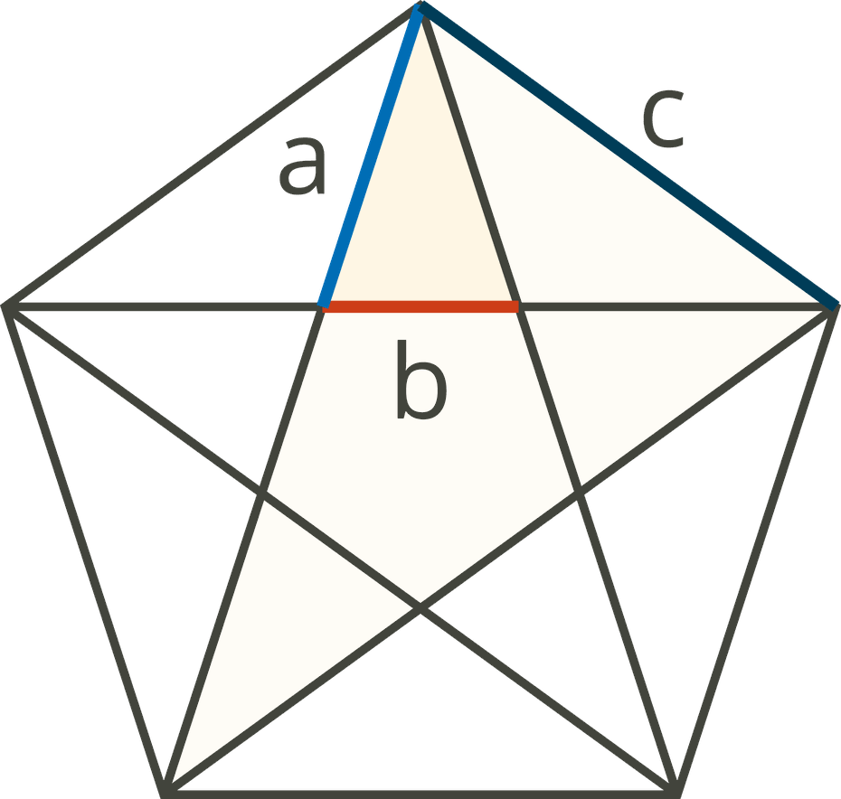
This geometry is present in various regular geometric figures such as the pentagon and the dodecahedron.
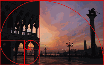
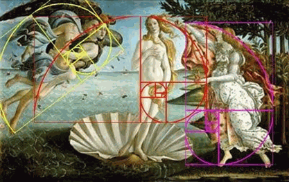
As an extension of this composition, we can build the golden spiral, very useful in composition, and also present in other forms of visual expression such as photography or painting.
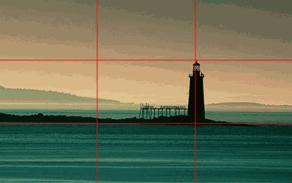
Now that we also treat the subject of photography, at this point it is also convenient to mention what is known as the rule of thirds, whichinvites us to place the elements that stand out in a composition at the intersection of the segments that result from dividing an image into 3 parts for each axis.
Grid Development
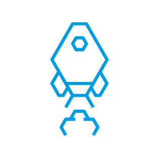
When developing logos, iconography or simmilar elements, it is useful to rely on a grid type system, similar to the one seen in the Apple logo or in the one shown below, the icon developed for one of our clients, the GSIC (icon with hexagonal base).
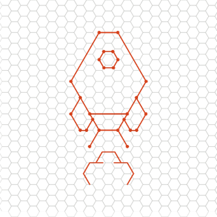
These grids simplify construction and harmonize the final design, facilitating the ideation process and making adjustments by successive approximations ranging from the sketch to the finished art.
Gestalt Principles
In addition to the aforementioned rules, the current of Gestalt, current of modern psychology emerged in the twentieth century proposes the following laws or principles regarding composition:
The whole is greater than the sum of its parts.
- Wolfgang Köhler
Proximity
The distance between the elements plays a key role in the perception of the whole. Faced with a constellation of stimuli we tend to group the closest members in space, integrating them into a unit.

Similarity
There is a natural tendency to connect similar or equal elements (in shape, color, or dimension), to give cohesion to the design, since our brain automatically searches for patterns in the set.
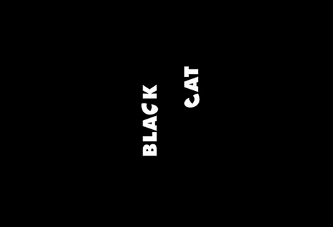
Black Cat. We group the letters “C”, recognizing in them the shape of the eyes of a black cat blending into the background.
There is a natural tendency to connect similar or equal elements (in shape, color, or dimension), to give cohesion to the design, since our brain automatically searches for patterns in the set.
Black Cat. We group the letters “C”, recognizing in them the shape of the eyes of a black cat blending into the background.
Closure
The Closure Law occurs when an object is incomplete, or its outline is not delimited. Closed forms are more visually stable than open ones, which is why the human brain tends to auto complete them.
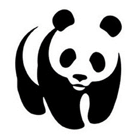
WWF. The silhouette of the panda is clearly distinguished despite not having a fully delimited outline.
The Closure Law occurs when an object is incomplete, or its outline is not delimited. Closed forms are more visually stable than open ones, which is why the human brain tends to auto complete them.
WWF. The silhouette of the panda is clearly distinguished despite not having a fully delimited outline.
Common Destination
A collection of different objects that seem to move in the same direction and at the same speed are perceived as a group.

HELIUM. The apex of the letter "i" indicates an upward direction making a clear reference to helium balloons.
A collection of different objects that seem to move in the same direction and at the same speed are perceived as a group.
HELIUM. The apex of the letter "i" indicates an upward direction making a clear reference to helium balloons.
Background Figure Law
Symmetry
Symmetrical images are perceived as equal, as a single element, in the distance. It has such transcendence it goes beyond the field of the perception of forms to constitute one of the fundamental phenomena of nature. Biology, mathematics, chemistry and physics, and even aesthetics themselves, are organized following the simple or multiple mirror laws of symmetry.
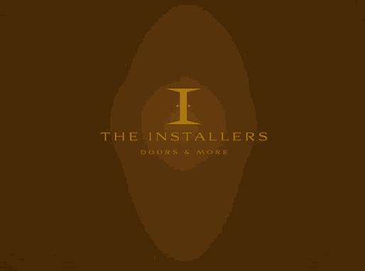
The Installers. The letter "I" being symmetrical refers to two open doors.
Geometric Shapes and their meaning
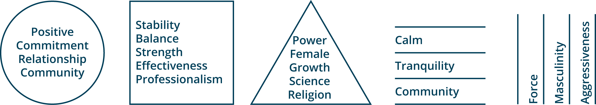
As for the geometric shapes present in the compositions, it is interesting to project the following conclusions:
Circle: Positive emotional message, Community, Relationships, Commitment, Feminine forms, Affable.
Square: Stability, Balance, Strength, Professionalism, Effectiveness.
Triangle: Power, Science, Religion, Law and Justice, Female (pointing downwards), Male (pointing upwards)
Horizontal Lines: Community, Tranquility, Calm.
Vertical Lines: Masculinity, Strength, Aggression
Horror Vacui
The tendency to reject empty spaces is interesting, as they are perceived as a waste of resources and opportunities.
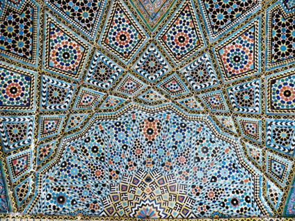
Horror vacui is used in art to describe the action of filling the entire space of the work with any element. This is mainly applied to art, being present in Baroque churches, Victorian houses, Islamic decoration, and in Greek and Byzantine art. Making decisions such as leaving a blank page, a wide margin for the body of a short text or using a small illustration on a large page, among many other eventualities, creates conflicts as to whether or not the use of space is correct. On the other hand, the minimalist style is presented as a strong trend in which small objects occupy large spaces, valuing the saving of resources. The main motto of this movement is «Less is more».
TYPOGRAPHY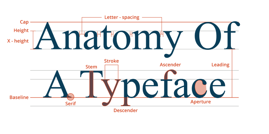
TYPOGRAPHY
Your choice of typeface is as important as what you do with it.
- Bonnie Siegler
When we talk about typography, we refer to the set of signs that the letters represent. This concept is used to name the study, design, and classification of fonts, as well as character design. The same text with different typography conveys totally different sensations and meaning. It is for this reason that typography is one of the most important pillars of design and it is extremely important to select the correct one, considering what we want to convey and the objective and recipient. When selecting the typeface, both the format (advertising poster, magazine, packaging ...) and the medium in which it is to be produced (printed or digital) are considered. The communicative capacity of the typography and its readability may vary depending on the medium in which it is represented and it is also important to take into account the length of the text to promote readability and thus facilitate reading.
Font Design
The first distinction we can make when studying a typeface is between Serif and Sans Serif fonts.
Serif
Serif fonts have their origin in the past; when the letters were carved in stone blocks and finished off the ends as it was difficult to ensure that the edges of the letters were straight. The serif font includes all Roman and Egyptian typefaces. For example: Times New Roman, Palatino, Georgia, Garamond, Rockwell, Baskerville, Trajan, Centaur, Monticello ...
By using this typeface, we convey seriousness, tradition, and respect. When these fonts can be used in long texts, it favors their readability by creating an imaginary line under the text.
Sans Serif
In French, the word 'sans' means 'without', so the term sans serif literally means without serif. The sans serif or Etruscan fonts have their origin in England in 1820, and are typefaces with straight serifs, which lack serifs. This type of font is associated with commercial typography due to its good readability for short and large texts. Likewise, they are suitable for on-screen display, since they are very legible at a smaller size.
These types of sources include all Palo Seco; Arial, Helvetica, Tahoma, Century Gothic, Verdana, Monaco, Geneva, Impact, Avant Garde Gothic, Futura, Avenir ...
San Serif fonts convey modernity, security, joy, minimalism, lightness and neutrality.
Monospaced
Monospaced font type is one in which its letters and characters take up exactly the same amount of horizontal space; this is different from variable width fonts, where the letters differ in size from each other. The first monospaced typefaces were designed for typewriters, which moved the same distance forward with each keystroke. This letter was used in older computers and terminals, which generally had very limited graphic capabilities. With the hardware implementation, text mode was simplified, in which the screen was made up of a grid, where each cell could be occupied by a character.
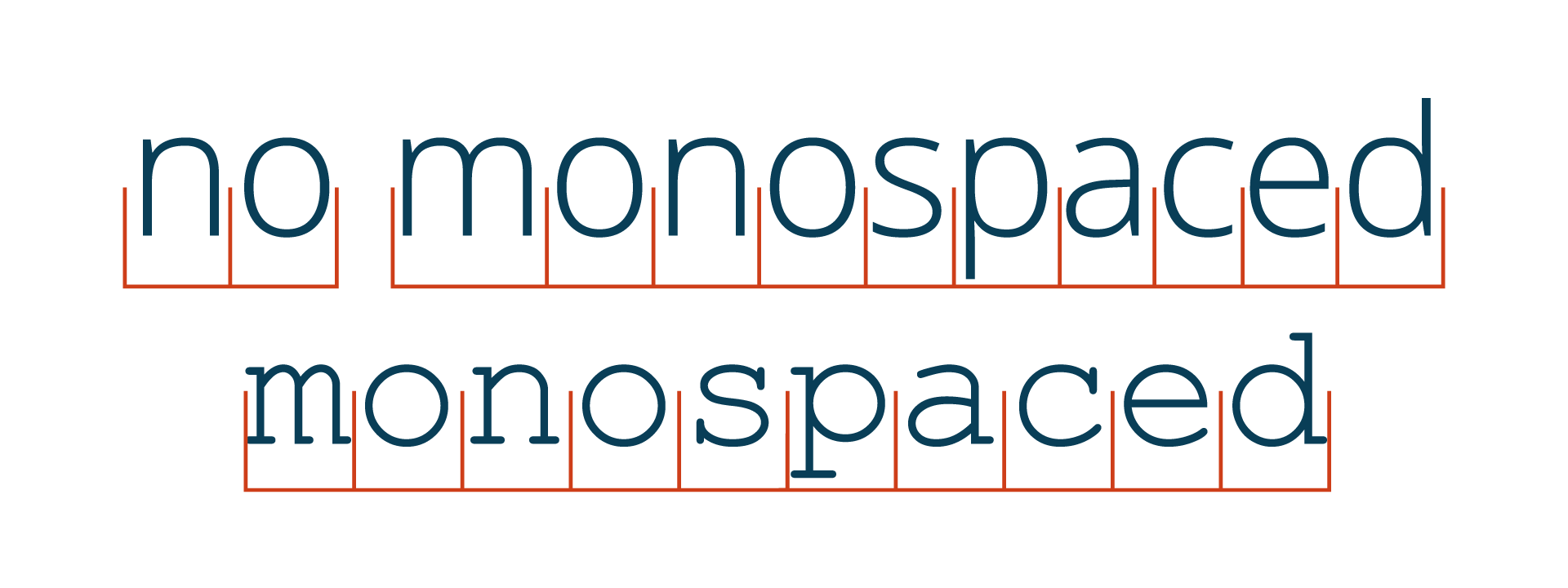
In modern computers, monospaced typefaces are used mostly in IDE and text editors. This increases the readability of the source code, where it is important to differentiate between individual symbols. Monospaced typefaces are also used in terminal emulators, for tabulating data in plain text documents, and for creating ASCII art.
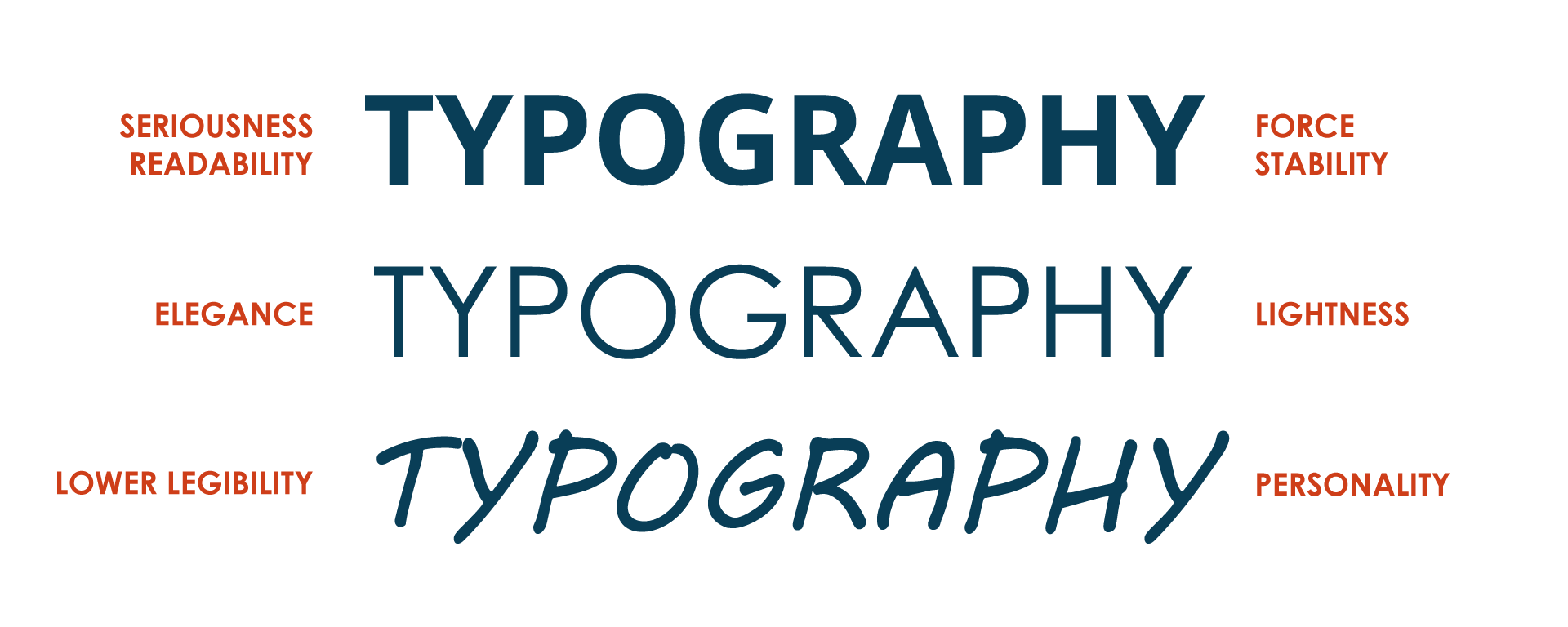
Font weight
The typeface in its standard format can have a stroke of greater or lesser thickness, giving rise to light and bold fonts. This terminology is also used to represent the same font also in different weights.
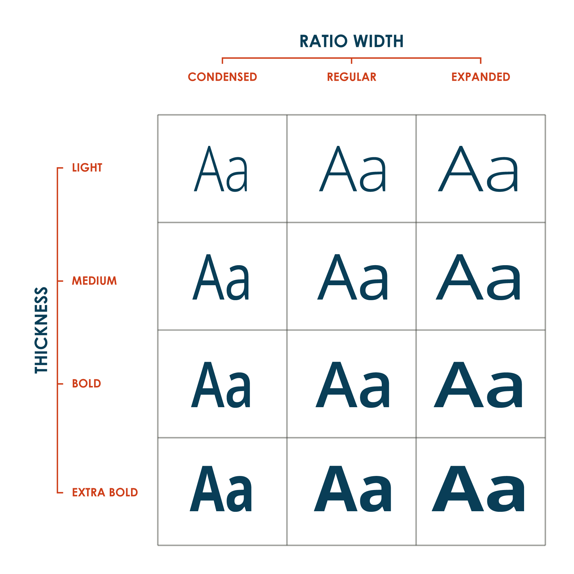
Light
Light fonts are those that are visually thinner than common typefaces; These fonts are distinguished by their visual aesthetics and size. The body size of light fonts is very thin and thinner fonts tend to have a pointed, rising serif.
For this type of font, it is recommended:
Use contrary colors such as dark background color and light font color or dark font color and light background.
Use the largest font size (taglines, introductions, headlines, etc).
Keep a simple design.
Use contrary colors such as dark background color and light font color or dark font color and light background.
Use the largest font size (taglines, introductions, headlines, etc).
Keep a simple design.
Bold
In typeface, a complete variant of the character set of a font that is thicker than is considered normal is called "bold". In bold fonts, the horizontal axis tends to increase in thickness while the vertical remains almost the same. The strokes expand across the width, not the height. This font is used mainly to make a part of the text stand out or emphasize.
Font Format
True Type and PostScript
TrueType was invented by Apple as a competition for Adobe's PostScript Type1. Both TrueType and PostScript fonts became the standard file formats for fonts during the last 3 decades of desktop publishing. In terms of their design, the differences between the two are relatively minor.
Open Type
OpenType was designed to replace them and was initially created by Adobe and Microsoft. It is basically a newer format that is more robust. For a designer, the main benefits of OpenType over the previous formats are:
A much larger set of characters
Automatic support for alternate characters
Ligatures (for software that supports it).
Color Theory
The color that we perceive can be explained from a physical point of view as the result of the absorption of certain wavelengths when light passes through or reflects off an object. Color is a basic pillar of graphic design that allows us to complement the shape.
Color Psychology
The human psyche tends to associate colors with different emotions or sensations. Colors influence us, they can modify our mood, predispose us to an idea, modify a first impression or convey feelings. That is why it is so important to know what each one transmits, to be able to use their influence when it is necessary, be it to create a brand, present an idea or sell ourselves.
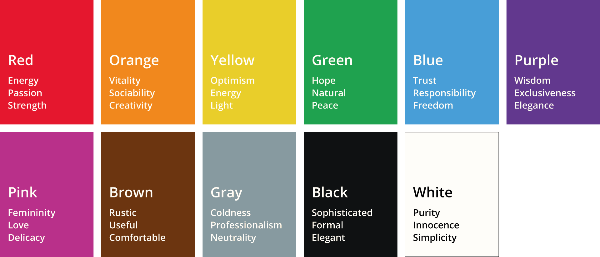
Red represents energy, passion, and strength, but it can also represent aggressiveness, rebellion or danger. It's vibrant, creates contrast, and demands the viewer's attention.
Orange is the color that evokes vitality, sociability, creativity and energy. It is related to the sun and fire.
Yellow is a color that evokes optimism, energy, light, but also prudence.
Green is the color of nature. In addition, it is a color associated with hope, nature and, therefore, peace. It is also the color of money and luck.
Blue is associated with trust, responsibility and freedom. It communicates loyalty and honesty, which is why many would choose it as a corporate color.
Violet is a mysterious and mystical color, of wisdom, and that transmits an image of exclusivity and elegance.
Pink, although it has been associated with femininity, transmits love, peace, romance and delicacy.
Brown communicates an earthy, solid and sensual message. Rustic, useful and comfortable are associated, but also poor and simple.
Gray is a color that conveys coldness, professionalism and neutrality. It is a color that is associated with the practical, reliable and authoritative.
Black adds seriousness to any project. It is a color that evokes us to be sophisticated, formal, and elegant.
White is a contrasting color that brings drama in combination with dark colors. In Western culture it is a symbol of purity, innocence and simplicity.
RGB, CMYK and HSL scales
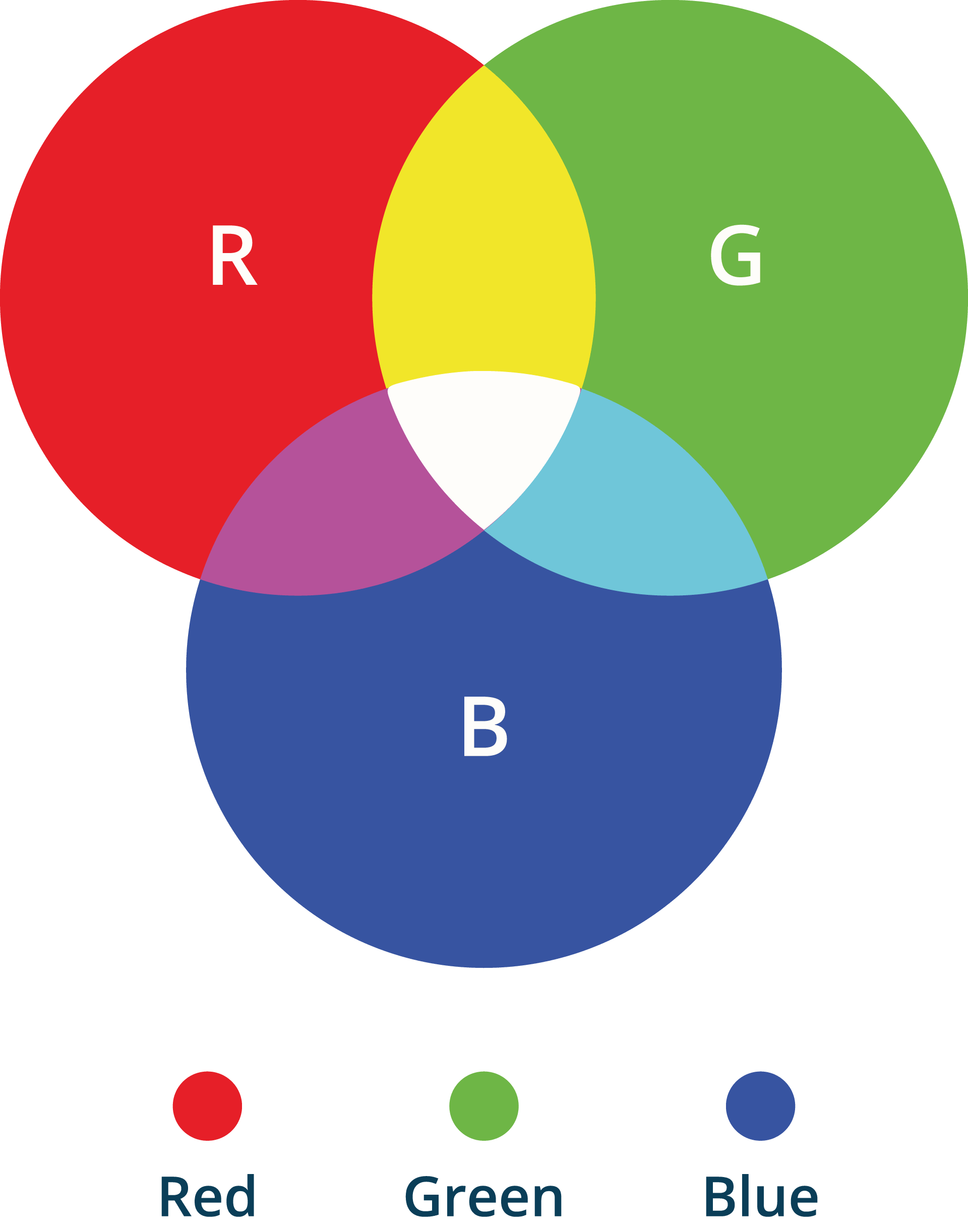
The RGB system, whose initials in English refer to the three primary colors (red, green, and blue), uses these as the main components to produce the rest of the colors. It is usually used in monitors where each of the colors is associated with a value which, in the case of an 8-bit color depth, will be 256 possible values (0-255).
By having three color channels (red, green and blue), this gives a total of 16.7 million representable colors. The RGB scale is the most used in systems that generate color as the addition of light (monitors, screens, lighting ...).
The combination of the three primary colors is white and the absence of all of them is black. The combination of the main colors Red, Green or Blue are accompanied by the secondary ones: Yellow, Cyan and Magenta; these in turn can be combined with each other to give rise to all the colors of the chromatic circle.
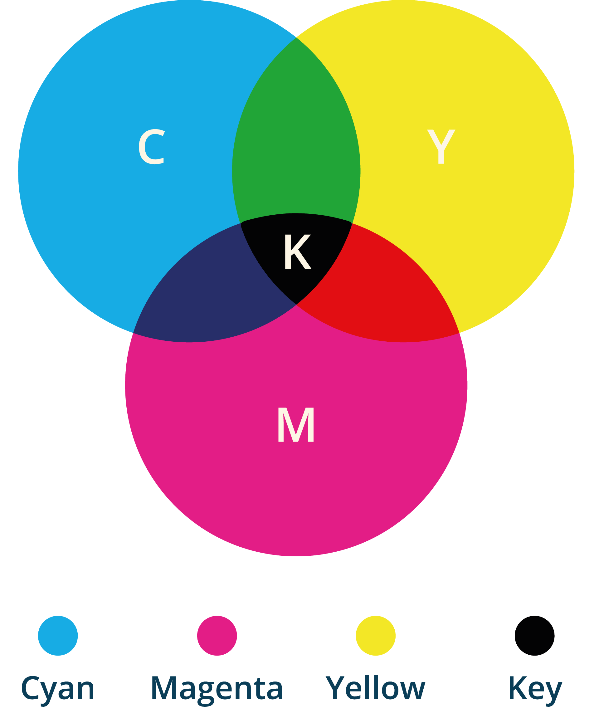
For digital printing and other non-digital graphic arts, it is common to use the subtractive color scale CMY or CMYK of its acronyms Cyan (C), Magenta (M) and Yellow (Y) classified as basic inks. This system includes the primary or fundamental colors plus a quarter, black (K), used to darken the colors.
Printing these inks either as solid layers and producing spot colors, or by printing in a dot pattern or generating halftones, is how all other colors can be obtained. This scale is used by printers, and it is common that, to ensure better quality and more accurate colors, graphic designs created to be printed are done in CMYK format.
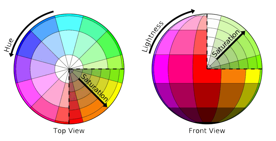
Finally, comment on the existence of the HSL system whose acronym in English stands for tone, lightness, and saturation. This system has its origin in chromosynthesis by the articulation of pigments. These three elements refer to the inherent and fundamental characteristics of any color. This system conceives the generation of colors starting from a specific tone, and then proceeds to look for the different shades, manipulating the percentages of saturation and luminosity. This allows us to generate color palettes of the same tone.
Color Harmony
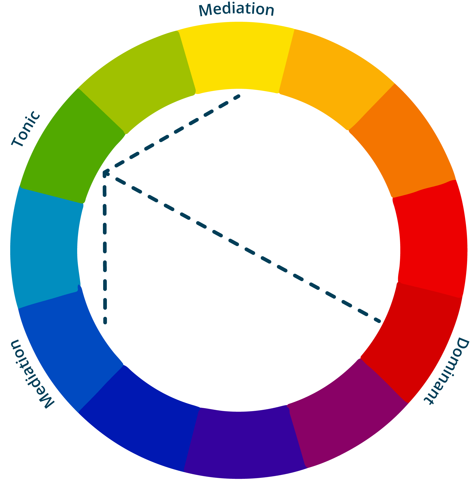
Classical theory says that, analogously to the composition of a musical chord, any color harmony system is made up of three colors:
A dominant one: which is the most neutral and the longest. It serves to highlight the other colors that make up our graphic composition, especially the opposite.
The tonic: it is the complementary color of the domain. It is the most powerful in color and value, and the one that is used as a note of animation or boldness in any element.
Mediation: which acts as a conciliator and mode of transition between each of the two above. It usually has a situation in the chromatic circle close to that of the tonic color.
Principle of familiarity: it is based on the fact that familiarity is pleasant and easily accepted. He says color combinations that are based on nature will look nice to most people. Also, light, and dark variations of the same color will harmonize with each other.
Novelty Principle: Says that although people like harmonic color combinations, this combination becomes boring, therefore a new combination will attract attention and make the whole composition more pleasant and harmonious.
Principle of similarity: Establishes that colors harmonize more when the differences between them are less. The use of multiple colors of different hue and clarity should be avoided. However, he also says that the same range of clarity can be nice, like a composition based on pastel colors.
Principle of order: Suggests that colors should be based on an orderly plan. It can be the analogous color combination, contrasting color combination, or triadic color combination.
Avoid ambiguity: Suggest that one should not use colors that appear inconsistent with the rest of the color scheme that has been chosen.
All colors are the friends of their neighbors and the lovers of their opposites.
- Marc Chagall
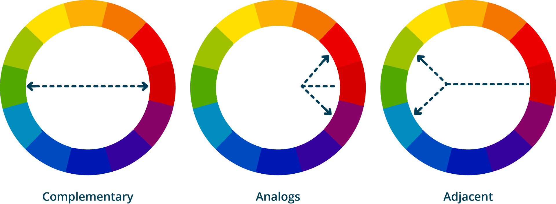
Also, we can use the color wheel to find these combinations.
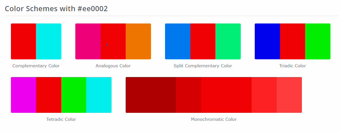
Complementary Colors: those opposite colors in the chromatic circle. Their combination results in gray. The main characteristic is the tone contrast, which is higher the higher the color saturation. The problem of using complementary colors together with high saturation values is what is known as vibration, a visual phenomenon that happens when the edges of two highly saturated complementary colors come together giving the sensation of blurriness and brightness, generating the illusion of movement. The complementary ones harmonize when one is pure and the other is altered in value or, being the two pure, when their extensions or areas are very different, the primary ones are also harmonious when one or two of them are neutralized with a mixture of the other.
Analogous Colors: those close colors in the chromatic circle. These palettes are often prevalent in nature, for example the color of the leaves in autumn that generates a gradient as they change color. They tend to give better results if used with warm or cold colors, creating palettes that have a certain temperature, as well as color harmony. On the other hand, these combinations tend to generate little contrast and are less vibrant than the complementary ones.
Adjacent Complementary Colors: are those that are located on both sides of a complementary color. The adjacent colors have a family similarity, and form what are called analog harmonies.
Once you have defined the colors that make up the image of our company, the harmony or balance between them must be considered. It is not easy to know which colors combine with each other, even if we are clear about what we want to convey.
The harmony of color and balance make a design more effective. To guide us correctly, it is best to use the chromatic circle, in which each one of the colors with which we can compose our designs is represented.
From this tool you can create color combinations with a correct harmony between them. In general, one of these three points must be considered:
Use colors belonging to the same chromatic range, that is, different shades of the same color.
Use complementary colors, colors opposite each other in the color wheel.
Combining colors in triads, is achieved starting from an equilateral triangle in the chromatic scale, achieving a combination of three colors, although excess of too many colors is not recommended and it is always good that there is a predominant color.
Resources
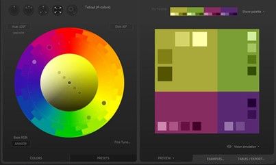
Paletton . A simple online application to select the most suitable color for the layers of our map with the possibility of combining gradients or complementary shades. Paletton's proposed color variety is supported by studies on color theory, perception, psychology, vision, color blindness, and much more information related to colors, including color combinations and general efficacy of color use.
Colorhexa. A simple, elegant solution that focuses solely on fulfilling its specific mission; offer all the information we may need on any color. For this, it is presented in the form of a search engine where we can enter colors in any value, as well as make combinations of multiple colors and create gradients by choosing two extremes.
Graphic Design Fundamentals